Color is one of those creative elements people feel before they consciously notice it. It’s the difference between a video that looks polished and intentional and one that feels a bit “off,” even if the script and visuals are strong. Color influences mood, readability, credibility, and—most importantly for marketers—brand recognition. Yet for many video creators, color is also one of the most time-consuming parts of production: tweaking text colors scene by scene, adjusting overlays, trying to make backgrounds and accents feel cohesive, and still wondering if the final product actually looks consistent.
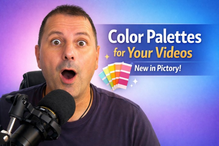
That’s why the new Color Palettes feature in Pictory matters. It’s not just a “nice-to-have” design upgrade. It’s a workflow improvement that helps you apply curated, cohesive color schemes across your entire project—quickly and consistently—without the manual effort that usually comes with good design.
In this article, we’ll break down what Color Palettes are, where to find them in Pictory, how to use them effectively, and how to combine them with your Brand Kit for reliable, repeatable branding. We’ll also get practical: which palette choices work best for different types of videos, common mistakes to avoid, and how to use palette “shuffling” to explore variations without blowing up your timeline.
Why Color Matters More Than You Think in Video
Before getting into the feature itself, it’s worth acknowledging why color is such a big deal—especially in short-form and marketing videos where you have seconds to earn attention.
Color drives first impressions
In many cases, your viewer decides whether a video feels “trustworthy,” “professional,” or “high quality” almost instantly. Color plays a major role in that perception. A cohesive palette signals intention and craft. Random or inconsistent colors can make even great content feel scattered.
Color supports your message
Different colors evoke different emotional cues. Warm tones can feel energetic and inviting. Cool tones can feel calm and modern. High contrast can create urgency, while soft tonal harmony can feel reassuring or premium. Your palette doesn’t just decorate your message—it amplifies it.
Color improves readability
Text overlays are a core element in many Pictory videos. If the text, background, overlay, and accent colors don’t cooperate, viewers struggle to read, and your retention drops. A well-chosen palette helps ensure consistent contrast and legibility.
Color builds brand recognition
Brand recognition isn’t only about logos. When viewers repeatedly see the same color family in your content, it becomes part of your identity. Over time, your audience starts to recognize your videos before they even read your name.
Color saves time—or costs you time
Without a system, color becomes a never-ending set of micro-decisions: “Should this headline be white or off-white?” “Does this overlay clash with the background?” “Why does this scene feel darker than the last?” Multiply that across dozens of scenes and multiple projects, and it adds up.
Color Palettes are Pictory’s answer to all of this: one-click cohesion that still allows flexibility.
What Are Color Palettes in Pictory?
Color Palettes in Pictory are curated color schemes designed to work together across your video. Instead of manually adjusting text, background elements, overlays, accents, and graphics scene by scene, you can apply a palette and see the project update instantly.
Here’s what makes the feature especially useful:
- It’s centralized: you access a palette library inside the editor.
- It’s fast: one click updates multiple visual components.
- It’s flexible: apply to a single scene or the entire project.
- It’s exploratory: you can shuffle variations within a palette to find combinations that fit your footage and message.
- It’s brand-friendly: you can create custom palettes in your Brand Kit using your own colors, logo, and fonts, then apply them during setup or within the editor.
In short: you get design consistency without the manual design work.
Where to Find Color Palettes in Pictory
You’ll find Color Palettes in the editor under the Styles tab. Inside Styles, you can open the Color Palette library, browse options, and apply one with a click.
This is important from a workflow perspective because the Styles tab is already where many creators expect to make global design choices. By placing palettes there, Pictory keeps your visual decisions consolidated instead of scattered across multiple menus.
How to Use Color Palettes: Step-by-Step
Let’s walk through the basic workflow in plain language.
1) Open your project in the editor
Whether you’re creating a video from a script, an article, or existing content, get your draft built first. You can absolutely set a palette early, but many creators prefer to rough out the structure before styling. The good news is: palettes apply instantly even after your scenes are created.
2) Go to the Styles tab
In the editor, open Styles. This is where your palette tools live.
3) Open the Color Palette library
Inside Styles, open the palette library. You’ll see a selection of curated palettes designed to work well across typical video elements.
4) Click a palette to apply it
When you click a palette, Pictory updates your video’s look immediately. The palette can influence:
- Text colors (headlines, captions, callouts)
- Background elements
- Graphics and shapes
- Overlays
- Accent colors and highlights
5) Choose scope: one scene or the whole project
Depending on your needs, you can apply the palette to:
- A single scene (useful when one scene has unique footage that needs a special treatment)
- The entire project (ideal for brand consistency)
6) Shuffle palette variations
Here’s the fun part. Within a palette, you can shuffle variations to explore different combinations while staying inside the same cohesive color family. This is a powerful way to find the “best fit” for different footage types without starting over.
For example, you might love the general vibe of a palette but feel like the accent color needs to pop more on a particular scene. Shuffling variations gives you options without breaking harmony.
7) Fine-tune if needed (without losing cohesion)
Palettes are designed to reduce manual adjustments, but you still have creative control. Once the palette is applied, you can make small tweaks as needed. The difference is that now you’re tweaking within a cohesive system rather than improvising from scratch.
The Real Benefits: Why This Feature Is a Big Deal
Pictory’s Color Palettes aren’t just about looking pretty. They solve real production problems.
1) Stronger brand recognition
Using consistent color schemes across videos trains your audience to recognize your content. Over time, your style becomes familiar—even in crowded feeds.
2) Better visual harmony
Harmony means your video feels unified: no random scene that suddenly looks like it belongs to a different project. This is especially helpful in videos built from mixed stock footage, where lighting and tone can vary.
3) Improved viewer experience
Consistent colors improve readability, reduce visual friction, and help viewers focus on the message. The video feels easier to watch, which can translate into better retention.
4) Faster production (massive time savings)
If you’ve ever spent an hour adjusting colors across multiple scenes, you already know the pain. Palettes reduce that effort to a few clicks.
5) Easier experimentation
Because palettes apply instantly and shuffling gives you controlled variations, you can test different looks quickly. That makes it easier to match your visuals to your topic, audience, and platform.
When to Apply a Palette: Early vs. Late in Your Workflow
There’s no single “correct” timing, but here are practical guidelines.
Apply early if:
- You’re working with a brand identity and want consistency from the start
- Your video relies heavily on text overlays, captions, and graphics
- You want your early preview to reflect the final aesthetic (helpful for approvals or client work)
Apply later if:
- You’re still experimenting with structure and scene order
- You’re not sure whether the video should feel bold, calm, playful, or premium
- You want to first choose footage and then match the palette to the dominant tones
Either way, the feature is designed to make switching painless, which means you can change your mind without redoing everything.
Using Color Palettes for Consistent Branding With the Brand Kit
Curated palettes are great, but branding often requires something more specific. That’s where Pictory’s Brand Kit becomes the perfect companion to Color Palettes.
What you can add to your Brand Kit
For consistent branding, you can create your own custom palette and brand assets by adding:
- Your logo
- Your fonts
- Up to seven brand colors
Those brand colors become the foundation of your custom palette system.
How to apply Brand Kit styling
You can apply your Brand Kit in two main ways:
- During project setup (ideal for making branding the default)
- Inside the editor (useful for updating existing projects or testing variations)
Why “up to seven” colors is a sweet spot
Seven colors sounds like a lot, but it’s actually a practical maximum. A strong brand palette often includes:
- 1–2 primary colors
- 1–2 secondary colors
- 1 accent color (for highlights, buttons, emphasis)
- 1 light neutral
- 1 dark neutral
This gives the system enough flexibility to handle different scenes and text-on-footage situations while remaining consistent.
Practical Palette Strategy: How to Choose Colors That Work in Video
A palette that looks great on a website doesn’t always work well in video—especially when you’re placing text over footage. Here are a few practical rules of thumb.
Prioritize contrast for text
The most common video design failure is poor contrast. Your palette should support both:
- Light text on darker overlays/backgrounds
- Dark text on lighter overlays/backgrounds
If your brand colors are mid-tones, make sure your Brand Kit includes a light neutral and a dark neutral to maintain readability.
Use accents intentionally
Accent colors are powerful—and easy to overuse. In most videos, accents should highlight:
- Key phrases
- Buttons/call-to-action moments
- Important on-screen data points
- Section dividers or emphasis graphics
If everything is accented, nothing stands out.
Keep the vibe consistent with the message
Think of palette “mood” as part of the story. A serious topic benefits from more restrained, professional tones. A playful brand can use brighter, more energetic contrasts. The palette should reinforce—not fight—your narrative.
Consider the platform
- Shorts and Reels often benefit from slightly higher contrast, bolder accents, and clearer text
- Long-form YouTube content can lean into calmer, more cinematic palettes
- LinkedIn audiences often respond well to clean, modern, professional color systems
How to Use Palette Shuffling Without Losing Control
The “shuffle variations” capability is an easy way to explore looks, but it’s most effective when you use it with a purpose.
Use shuffling when:
- Your footage has a dominant color tone that clashes with your current variation
- You need more “pop” for a call-to-action segment
- A specific scene feels dull or too intense compared to the rest
- You want quick options without changing your overall palette family
Don’t use shuffling when:
- You’re already happy with the consistency and only need minor edits
- You’re working on strict brand guidelines where variation must stay within fixed values
- You’re trying to match an exact campaign theme and you’ve already approved the style
A good approach is to shuffle early in the styling phase, then lock in once you’ve found a variation that works across most scenes.
Best Practices for Different Video Types
Color palettes become even more powerful when you match them to the format and intent of your video.
Educational explainer videos
Goal: clarity and trust
Palette approach:
- High readability
- Clean neutrals
- One strong accent for key terms or steps
- Avoid overly saturated backgrounds that distract from the lesson
Social media promos and ads
Goal: stop the scroll and drive action
Palette approach:
- Strong contrast
- Bold accent color used sparingly for calls-to-action
- Consistent look across multiple creatives for campaign cohesion
Brand storytelling and testimonials
Goal: emotional connection and authenticity
Palette approach:
- Softer tones that complement real footage
- Subtle overlays
- Accents that feel “human,” not overly graphic
Webinar highlights and podcast clips
Goal: readability over varied footage
Palette approach:
- Reliable overlay system
- Strong dark neutral + light text option
- Accent color for speaker name, topic, or key takeaway
Product demos
Goal: focus on the product and steps
Palette approach:
- Minimal, clean palette to avoid competing with the UI/product visuals
- One or two accents to guide attention
Common Mistakes to Avoid With Color Palettes
Even with a great feature, a few habits can undermine results.
1) Using too many accent colors
If you have multiple accents competing, the viewer won’t know what’s important. Choose one accent that signals importance, and let neutrals do the heavy lifting.
2) Ignoring how colors interact with footage
A palette can look perfect on plain backgrounds and still struggle on real-world footage. Use overlays strategically when needed, and don’t be afraid to shuffle palette variations to find one that sits better against your scenes.
3) Changing palettes mid-video without intent
Sometimes it’s a creative choice—like switching palette for a new chapter—but random shifts can feel like inconsistency. If you plan to change palettes for sections, do it deliberately and repeat the pattern so it feels like a design system, not a mistake.
4) Over-styling every scene
Consistency is often more powerful than constant visual novelty. Let your message and pacing do the work, and use color changes sparingly for emphasis.
A Simple “Brand Kit Palette” Template You Can Copy
If you’re building a custom palette in your Brand Kit and don’t know where to start, here’s a practical structure for your seven colors:
- Primary color (your main brand color)
- Secondary color (supports the primary)
- Accent color (high-visibility highlight)
- Dark neutral (for text/overlays)
- Light neutral (for backgrounds or text contrast)
- Soft background tint (subtle panels or lower-thirds)
- Optional seasonal/campaign color (for promotions, launches, or special series)
This setup helps your videos stay branded and readable across different footage and styles.
Why This Feature Changes the Day-to-Day for Creators and Teams
If you’re a solo creator, Color Palettes reduce friction and help your videos look more professional with less effort. If you work on a team, the impact can be even bigger.
- Editors can maintain consistency without memorizing brand rules.
- Marketing teams can keep multi-video campaigns visually unified.
- Agencies can quickly apply brand styling across client projects.
- Content operations can scale output without sacrificing polish.
The end result is a workflow where design isn’t a bottleneck—and your brand identity doesn’t get diluted as you produce more content.
Getting Started: A Simple First Use Case
If you want to try Color Palettes immediately and see the value fast, do this:
- Open an existing project that has multiple scenes and text overlays.
- Go to Styles → Color Palette library.
- Apply a curated palette to the entire project.
- Shuffle variations a few times and observe how it affects readability and tone.
- Pick the variation that best matches your message.
- If you have a brand palette, create a custom palette in Brand Kit (logo, fonts, up to seven colors) and apply it either during setup or inside the editor.
You’ll likely notice two immediate outcomes: the project looks more cohesive, and you’ve saved a chunk of time you would have spent manually adjusting design elements.
Final Thoughts: Cohesion at the Speed of Creation
Video creation is moving faster than ever. Audiences expect frequent content, and creators are juggling scripting, editing, publishing, and performance tracking—often all at once. In that environment, anything that reduces repetitive work while improving quality is a serious upgrade.
Pictory’s Color Palettes feature does exactly that. By letting you apply curated, cohesive color schemes across every scene—and by pairing that with Brand Kit customization for logos, fonts, and brand colors—you get a system that supports consistency, experimentation, and speed.
If your videos have ever felt visually inconsistent, if branding has been hard to maintain, or if you’ve lost time trying to make everything “match,” Color Palettes are worth adopting as a default part of your workflow.
Start using Pictory Color Palettes, explore a few variations, and build a Brand Kit palette that reflects your identity. The payoff is immediate: better-looking videos, stronger brand recognition, improved harmony across scenes, and far fewer design headaches along the way.